

With the February 2019 release of Power BI Desktop, a new out-of-the-box visual called Key Influencers was introduced to Power BI. The first Artificial Intelligence (AI)-powered visualisation in Power BI is Key Influencers. With features like Natural Language (Q&A) and Quick Insights, Microsoft has long incorporated AI capabilities into Power BI. Developers of Key Influencers reports, on the other hand, now have explicit control over how they use AI to discover insights in their data. Furthermore, Key Influencers is essentially a collection of visuals in one! Let’s take a closer look at how to use this new visualisation.
Key Influencers Example
When learning new Power BI features, I find that starting with an example is a good way to get started. So go ahead and download the report and experiment with the new Key Influencers visual for yourself! After you’ve played around with the report, keep reading to find out more about specific features.
NOTE: The data in this post’s downloadable report and screenshots comes from the Adventure Works demo database. All of the data is made up and is only being used to demonstrate the new Key Influencers visual. Customer demographical attributes are used in the sample report to explain a calculated column called Customer Type. Customer Type determines whether a customer is a repeat customer (i.e., multiple purchases found) or a one-time customer by counting the number of purchases made by each customer.
Two for the Price of One!
There are two tabs in the Key Influencers visual: Key Influencers and Top Segments.
NOTE: The name of the new visual is Key Influencers. There is also a tab with the same name within the visual.
The Key Influencers tab will show a ranked list of the individual contributing factors that drive the condition you’ve selected. The Top Segments tab takes things a step further by displaying groupings of key influencers and their impact on the condition you’ve chosen.
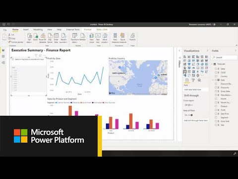
Getting Started with the Power BI Desktop
Key Influencers Tab
The Key Influencers tab uses logistic regression to analyse your data and identify the most important factors that influence a particular metric or condition. For example, in the screenshot below, the Key Influencers visual is being used to identify the drivers behind both repeat customers and customers who have only made one purchase and thus may have churned. We can use Key Influencers to tell us what factors contribute the most to each outcome in a matter of seconds, rather than spending minutes, hours, or even days creating various visuals and reports to analyse our customer base.

1 – Examining the key influencers that encourage customers to return.
Changing the value in the drop-down box will allow us to run a separate analysis on our subset of one-time customers.

2 – Select a different condition or outcome from the drop-down box.
One of the things that makes Key Influencers such a fun visualisation is that it essentially combines multiple visuals into one. Even the Key Influencers tab itself has two visual panes. On the left-hand pane, for example, you’ll find an infographic of the key influencers themselves, ranked according to their relative impact on the condition under consideration (in our case, repeat customers).

3 – The most important driver in the dataset for determining repeat customers is the customer’s country of origin, which is Australia.
When a key influencer is selected in the left-hand pane, a chart with the values of that attribute, as well as the average percentage that value matches the condition, appears in the right-hand pane. For instance, according to the screenshot below, roughly 72 percent of Australian customers have made a repeat purchase. In comparison, only 29 percent of customers in the other individual customer countries, including the average of all other countries, have made a repeat purchase.

4 – Australian customers are 72 percent of the time repeat customers.
The chart in the right-hand pane will change if you click on a different Key Influencer. The chart will also be displayed as a scatterplot if your key influencer is a continuous attribute, as shown below.

5 – As a customer’s annual income rises by $33k, they are 1.5 times more likely to return.
Top Segments Tab
You can see how groupings of key influencers affect the selected condition on the Top Segments tab. The segments are ranked according to the percentage of records that satisfy the condition. Each segment bubble’s size represents the number of records (population count) in the segment.

6 – The Top Segments tab identified five key influencer segments, or groupings, that drive the outcome of repeat customers.
The Top Segments tab, like the Key Influencers tab, provides us with a variety of visuals to experiment with. You can, for example, click on a segment bubble to see which key influencers come together to form that segment. According to the screenshot below, Segment 1 consists of customers from Australia who do not have children at home and have an annual income of more than $55k. When a customer meets those criteria, they are 77.2 percent more likely to return, compared to 37.1 percent on average. This segment accounts for 8% of the dataset, according to the graphic. To put it another way, 8% of our customers are Australians without children who earn more than $55,000 per year.
Finally, the Top Segments tab allows you to delve even deeper by selecting Learn more about this segment from the drop-down menu. When you click that button, you can experiment with different scenarios to further break down your segment by key influencer fields.

7 – Select Learn more about this segment to experiment with different scenarios and find new patterns.
Interactivity
Key Influencers is fully interactive, so you can manipulate the results with filters, slicers, and selections on other visuals. For example, we can use our country slicer to re-run the Key Influencer analysis for only customers in the United States.

8 – The United States has been chosen, and the results of the Key Influencers have been recalculated.
Then, in our Sales Amt by Education bar chart, we can cross-filter by selecting the Graduate Degree bar. Observe how the key influencers have shifted, with having a Professional occupation now having the greatest influence.

9 – Key Influencers are also affected by cross-filtering. The results are now for Repeat Customers with a Graduate Degree from the United States.
Configuring the Visual
It’s simple to set up the Key Influencers visual. Analyze and Explain By are the two sections where you can drop fields. You’ll drop your field into Analyze if it contains a condition or result you’d like to explain. This is where the Customer Type field appears in our example. The Explain By section is where you’ll drop any fields that you think might have an impact on Customer Type’s results. For example, I used to believe that a customer’s annual income and the number of children living at home could both influence whether or not they made repeat purchases. The visual doesn’t have a lot of formatting options, but you can turn off the Key Influencers and Top Segments tabs.

10 – Configuring the Key Influencers visual.

11 – From the formatting pane, you can enable or disable the Key Influencers or Top Segments tabs.
Limitations
Due to the fact that the Key Influencers visual is currently in public preview, there are a few limitations to consider. The following list is based on Microsoft’s own documentation, which you can find here.
The following features are currently unavailable:
- Metrics that are aggregates/measures are being examined.
- Using Power BI Embedded to consume the visual
- Using Power BI mobile apps to consume the visual
- Support for RLS
- Support for Direct Query
- Support for Live Connection
Publish to the web (thus the download link for the report)
Final Thoughts
For the time being, the Key Influencers visual will most likely be on the back burner for many organisations due to the limitations listed above. However, the visual’s initial preview is extremely promising. Microsoft is a leader in both BI and AI technologies, according to the 2019 Gartner Magic Quadrant for Analytics and BI Platforms. Key Influencers is the latest example of Power BI combining AI and BI capabilities, following Natural Language and Quick Insights.