
Drag and drop templates are the best place to start creating templates in HubSpot for beginners. Drag and Drop templates take advantage of a visual template builder, which generates HTML + HubL under the hood. It provides an intuitive interface which helps developers to easily organize and systematize their templates by just dragging and dropping the default HubSpot modules or custom modules. Templates contain references to stylesheets, JavaScript files and other assets used throughout a website or email. Pages, landing pages, blogs, system pages, and emails on HubSpot all use templates. When content creators create a page or email, they select a template to use before filling it with content.
Hi! I am Sumeet Hande, a front-end engineer at Addend Analytics and in this blog I will be sharing information about creating drag & drop templates in HubSpot.
To create a drag and drop template we first navigate to Marketing > Files and Templates > Design Tools. This is the Design Manager. In the Design Manager, navigate to the leftmost pane (The Finder) and click on File and select the New File option. Select the Drag and Drop Template option from the drop down menu and click next. While creating new templates, HubSpot asks us to specify the type of the Template (page, email, blog, etc), name and the folder on the hubspot file system where we want to save the template. After specifying these options and clicking on the create button, we get the following,
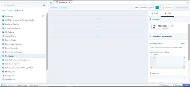
The center part of this design manager is the workspace where we will be dragging and dropping the modules. It is segregated into three areas namely, the header, body and footer. The header and footer sections mainly contain the navigation and other contact information which is kept constant across templates. That is why, the header and footer sections of a drag & drop template are usually kept as global modules.
For this demonstration, we will focus only on the body section. To add a module onto the template, we first click on the Add button found on the right most pane (The inspector), next to the edit button. A list of built-in hubspot modules gets displayed as shown below
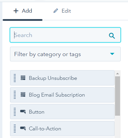
We can use the search bar to search for a built-in module or a custom module. Let’s create a two column for the first row in the body section which will consist of an image module on the left and two text modules on the right, (One line of text and rich text). When we first drag the image module onto the template, the template will look something like this,
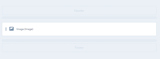
The body section now contains only one built-in module, the Image module. To create a two column, we select the “one line of text” module from the inspector and drag it to the right end of the Image module. This will divide the row in half and each module (image and one line of text) will occupy equal space as shown below,

We need to add one more module (Rich text), below the one line of text. After adding it just below the one line of text, this is how the template looks like,

HubSpot automatically groups the two modules (Text and Rich text) together. In terms of HTML, this is similar to creating a div element with two child elements in it. Now, as the structure for the two column row is ready, we need to provide more information to each individual module. When you click on a module in the template, it’s detailed information appears on the right in the inspector.

For the image module, we get to see options like “Styling options”, “Default Content”, “Editor Options”, etc.
The Styling options section mainly contains the css options which we would like to provide for the selected module. As you can see in the above illustration, we can provide a custom css class to this image module, provide some inline styling to it, or provide some wrapping html around this module (for instance, wrapping the module in a div element and giving it a specific class name). The small “i” in the circle after each option provides short information about each option.
The default content section will contain the default image, the size of the image, the alt text, etc (since the module is an image module). This is the content which gets displayed to the editor when the editor first edits a page created from this template.
The editor options section helps the developer to decide whether a particular module must be allowed to be edited by the editor or not.
We can edit the options for each module in this way by just selecting the module on the template and then editing the options on the right in the inspector section.
This is what the template looks like after changing the names of the modules,

These names are just labels which appear on the module as shown above. Giving descriptive names to modules can help other developers understand the template in a much easier way. For any css classes which we add to modules by using the “css class” field found in the styling options, the class names appear below the module name. For instance, in the above illustration, the image module which is labelled as “Two-column picture” has a css class attached to it which has the name “picture-size”. We can define the details of this css class in a separate css file and attach this css file to the template.
To add a stylesheet to the template, we first need to deselect any selected module. To do that, simply click on any blank space outside the template skeleton. After that, you will see the overall options for the entire template on the inspector as shown below,

(note: no module is selected here and overall options are now visible on the right)
Under the linked stylesheets section, we can click the “add” button to add new stylesheets. We can add multiple stylesheets to a single template. For this illustration, the homepage.css file only contains one class, i.e, picture-size

To see the output of the template, we have to click the preview button on the top right corner of the Design manager.

In this way, beginner developers can get started quickly with making templates using the drag and drop template method.
Sumeet Hande
Front-end engineer
Addend Analytics