

In this blog, we’ll be seeing the use of the default tooltip in Power BI as we need to see the sales amount and quantity in a single chart.
Plotting them in a clustered column chart shows that the sales amount is in thousands, but the quantity is in hundreds or even less than a hundred.
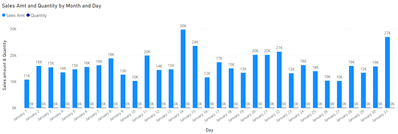
We cannot compare these kinds of values shown in the graph as the difference between their values is huge.
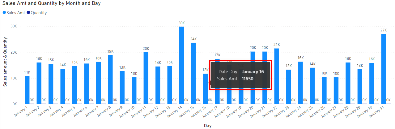
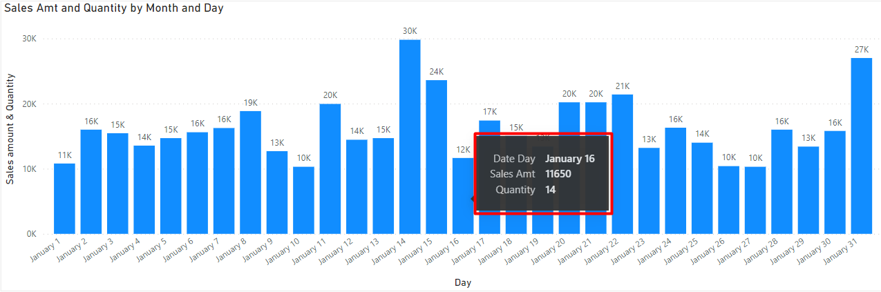
By default, we can see a tooltip when we hover over the bar of the clustered column chart as shown below.
Below are the steps to add Quantity in the Default Tooltip –
Step 01
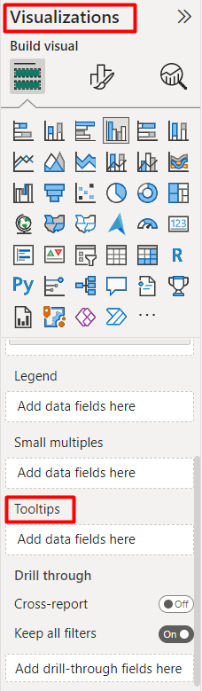
We have a Tooltips option in the Visualizations pane.
Step 02
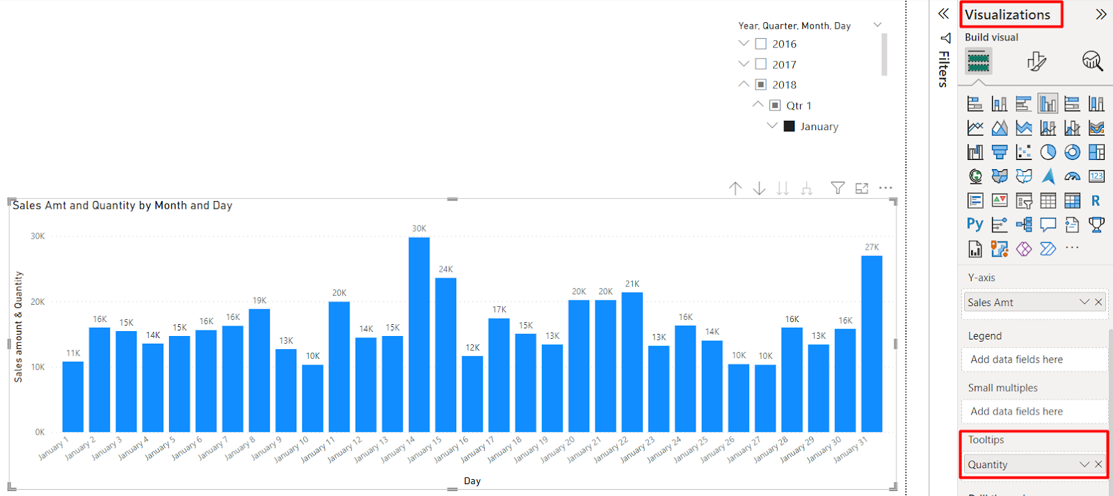
So, instead of putting the Quantity in the clustered column chart, we can add Quantity as the additional information in the Tooltips.
Result
So, what happens along with the sales amount we can see the Quantity not in the clustered column chart but in the tooltip.
Author By

Gaurav Lakhotia
Gaurav holds an MBA in Business Analytics. As a data geek and avid learner, he has earned accolades including Microsoft Certified Data Analyst, Microsoft Certified Azure Administrator, and active Power BI Community contributor. He is also a Microsoft Certified Trainer. With critical thinking and project delivery skills, he strives to achieve customer delight in Data Analytics projects. Gaurav loves travelling with friends when he is not busy working on data.