
Key Influencer is an AI visual in Power BI. It analyzes data, ranks the factors that matter and display them as Key Influencers.
Key Influencer Visual is used to
- See which factors affected the metric being analyzed
- Contrast the relative importance of these two factors
Fig1.1 : Key Influencer icon
The Key Influencer visual have two tabs : Key Influencers & Top Segments
Key Influencers : It shows the top contributors to the selected metric value. It displays a ranked list of the individual contributing factors.
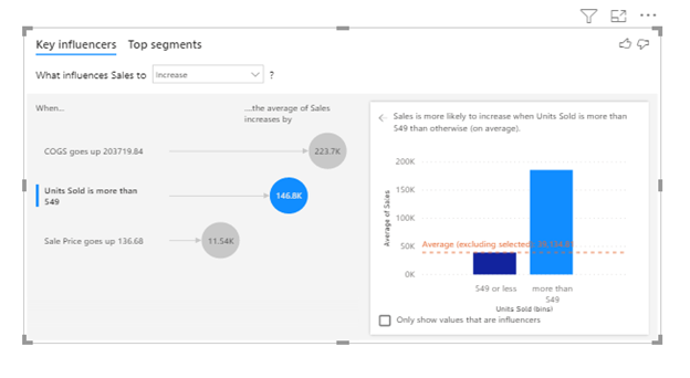 Fig 1.2: Key Influencers Tab
The left pane contains one visual which shows the top key influencers list. On selecting one of the contributors, Power BI shows additional details in right pane. Instead of spending minutes and hours on building a visual or report, we can use Key Influencers. It tells which factors contribute most within seconds. In the above visual describes that Sales is influenced by which factors. Clicking on different key influencers on left side changes the chart on right pane.
Top Segments : It shows the top segments that contribute to the selected metric value. A segment is made up of a combination of values. It shows the user that when the expected profit is likely to be low or high. Segments are ranked based on the percentage of records where the condition is met. The size of each segment bubble represents how many records are in the segment.
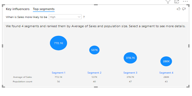 Fig 1.3 : Top Segments Tab
Like Key Influencers tab, Top Segments tab also shows different chart on clicking different segments.
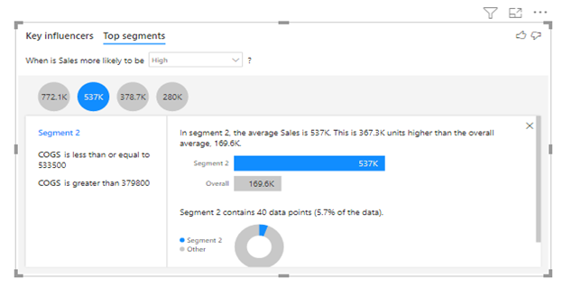
Fig 1.4 : Detailed view of selected segment
Configuring the visual
There are two sections to drop fields in: Analyze and Explain By. Analyze is where you will drop your field that contains a condition or result you would like to explain. The Explain By section is where you will drop your fields that you feel could influence the results.
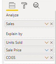
Fig 1.5 : Field Pane of Key Influencer Visual
We can toggle if we want to see Key influencer or Segments only. We can do it by using either of the below which can be found under the Analysis tab in Formatting Pane.
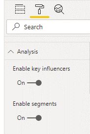
Fig 1.6 : Format Pane of Key Influencer Visual.
Praisy Joy
Data Analytics
Addend Analytics