
Custom Modules provide a fairly lower level of granularity to a developer so that a developer can create specific functionalities from scratch according to the requirements. The primary aim of custom modules is to provide reusability so that redundancy in code can be avoided, making your code more efficient, cleaner, and organized. A custom module is essentially a coded template, where the developer can code the HTML, CSS, and javascript for that particular module from the very beginning. It also provides HubL support, i.e., we can also use HubL in our HTML code.
Hi! This is Sumeet Hande, a front-end Engineer at Addend Analytics, and in this blog, we will dive into the technical aspects of module creation.
To create a custom module, we head over to the Design Tools. In the Finder, we select ‘File’ and then click on ‘New File’. From the dialog box, we select the module option and click next. Before the module is created, we have to set up the module by providing some options. The following illustration will clear this.
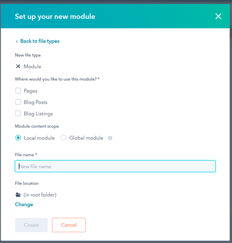
We have to specify the options as to where this module will be used, we have to provide a module name, whether this module is a global module or a local module, and the location where we want to store this module on HubSpot. Let’s create a Two-column Module, where on one column, we would have some text and on the other column, we have an image. We want this module to be used on pages, so tick the ‘pages’ option.
Then we specify the module’s scope as Local and then click the create button.
After hitting ‘create’, we get a screen as shown below,
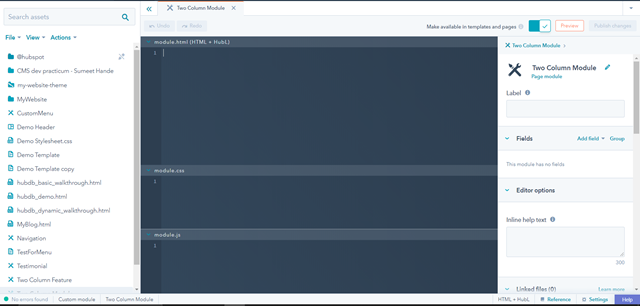
At the center, we have the main workspace where we will write the HTML, CSS and JS code. On the left, is the Finder and on the right, we have the Inspector. For now, let us add the markup for our module in the top section, i.e. the “module.html (HTML + HubL)” section. Here, we need not write the HTML code from the very beginning, that is specifying the html start, head, and body tags. This entire module.html section can be itself considered as the body section of a typical HTML page.
The important part to note here is that we are creating a module which will be used in templates. An editor will edit the “Editable parts” in this module to fill in their own contents according to the requirement.
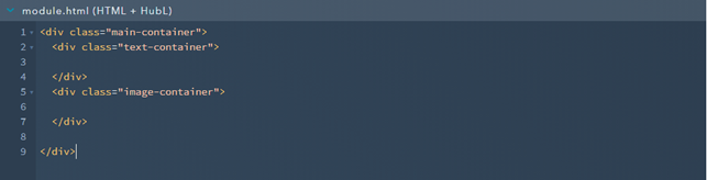
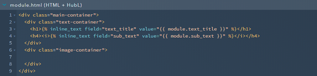
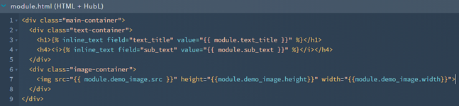
Let’s start with creating a parent container for our Two Column module. This parent container will have two separate sub-containers, one which will contain the text part and the other which will contain the image. This is what the skeleton code will look like,
Now, we need to create editable fields using HubL. These are the fields which the editor is going to fill in using their own content. For the text container, we will first create a simple text field. To do that, we access the Inspector to the right and click on the “Add field”.
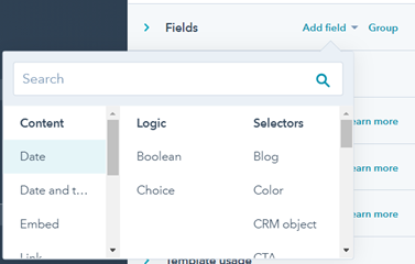
We can choose from simple text, rich text, URLs, Embeds, Images, videos, etc. Since we want to have a single heading, we will choose the “Text” option from the Content column. Fill in the details as shown below,
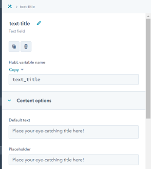
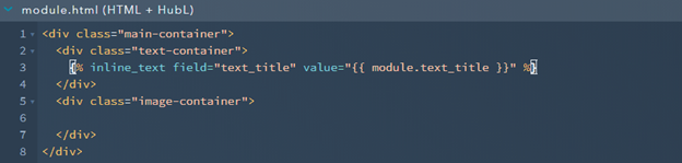
We can set options like the default text, the placeholder, whether we want this field as a compulsory field or not, should the editor be allowed to see this field in the editing column, etc. In the illustration above, we can see a line “HubL variable name” and a copy option below it. When we click on this “Copy” link, we can either select “Copy Value” or “Copy Snippet”. Copying the Snippet is the more suitable choice as with this option the entire HubL code to render this line of text on a HTML page will be copied. Select the “Copy Snippet” option and then right-click inside the text-container div (line 3) to paste the snippet onto the code area. It will look something like this,
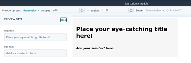
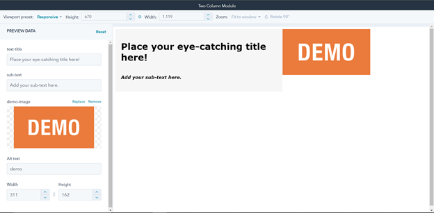
Now, in order to preview this module, we select the preview button on the top right corner of the page which opens up the editor view. The following illustration depicts the editor’s view.
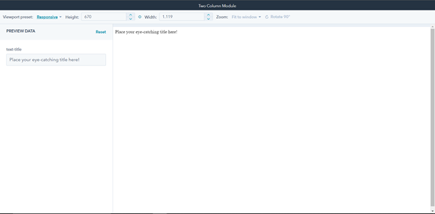
On the left, we have the “Preview Data” column. These are the options which the editor will see while using your module to insert their content. Since we created a simple text field for an editor to use, we can see it in the Preview Data palette to the left of the screen. The Default content and placeholder are also in-action as the way we wrote them while creating the “text-title” field. Let us add an H1 tag around this line of text and also add another field which will act as a sub-text. The following two images depict the changes in the code and the preview,

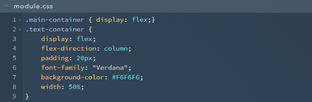
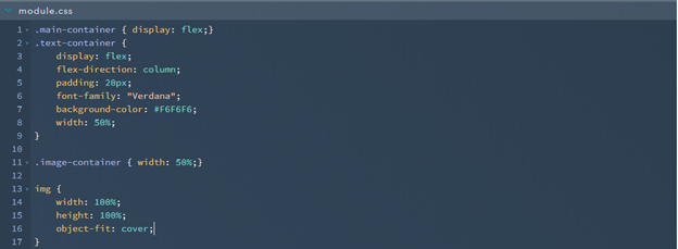
Now, let’s make some changes in the module.css section to make this text-container look a little better.
Now let’s work on the image container. Just like we have added the two text fields by using the Inspector, we will repeat the same procedure for images. However, instead of copying the snippet, this time we will only copy the value. We are doing this because, by default, HubSpot creates HubL code for a responsive image. This code can extend up to a few lines and may confuse beginners. So for this demonstration only, we will select the “copy value” option while creating the image field.
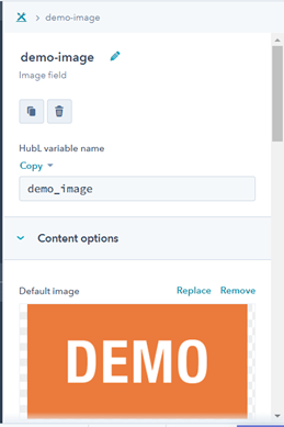
We can upload a default image for this field which will always appear whenever the editor loads the module. The editor can then replace this image with an image of their own. Now, if we click the preview, we will be able to see the image on the Preview data palette but not on the module itself. We need to add the markup for this image field in the module.html section. For this in the image-container div, we will use the <img> tag. This is what the code will look like,
We paste the copied value of the image field in the src attribute of the <img> tag and add “.src” to its end. We also need to specify the image’s height and width attributes. The values of these attributes are stored at module.demo_image.height and module.demo_image.width. As of now, when we preview the current state of the module, it will look something like this, with the default height and width of the image,
Since the size of the image itself is small, it does not occupy the entire width and height of its parent container i.e. “image-container”. In order to do that, we will need to specify some css properties for this image in the module.css section as shown below,
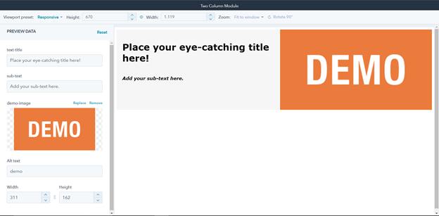
Now, after adding these properties to the image-container and the image tag, we see the following preview, with the image occupying the entire width and height of the container all the while retaining it’s aspect ratio.
So now our simple Two Column Module is now complete with editor options to edit the text and change the image. In order to make this template available for use, we first need to publish it by clicking on the “publish changes” button to the right of the preview button. We also need to make sure that the “Make available in templates and pages” switch is turned on so that this module is searchable and is available to be added in drag and drop templates. This was just one introductory simple example of how we can create custom modules. As per requirements, developers can harness this power of custom modules and use it to its maximum potential to create complex reusable custom modules.
Sumeet Hande
Front-end Engineer
Addend Analytics