
Hey there!
Today I am gonna discuss about creating the custom groups using calculation items.
Imagine yourself in a situation where you as a product analyst is planning to choose the color variants for a new product that your company is designing. You must be looking for some data that could display you the sales performances of the similar products that are in the market based on the colors.
I also agree, this will surely be giving you a deeper insight about the customer preferences…
What we will generally think of is a matrix that will display the Sales Amount of all the colors, and we will just simply apply a Color filter to them.
But…
What will you do when you wish to see the sales of the filtered colors vs. sales value of remaining colors in another column next to it!
It must be sounding weird!!!
Let’s go with an example…
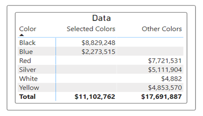
You have filtered the matrix based on the Black and Blue color. You have filtered the colors using slicer. But you need another column that will show the sales values of all the remaining colors- Red, Silver, White, and Yellow.
Here is the proposed view-

That seems interesting, right?
Let’s create this kind of matrix using simple DAX…
Before writing the DAX, I prefer to talk about my data. I am using AdventureWorks data, that is a sample data provided by Microsoft.
These following are the tables that I am using-
I will be leveraging Sales and Product table out of these tables.
Steps-
- Now, I will create a measure that will simply take Sales Amount from sales table-

This will give me the Sales Amount for the selected values in the Color slicer.
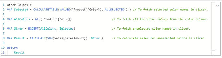
2. Now, I will create another column that will be able to calculate the Sales Amount for all the unfiltered colors i.e., for the values that are not selected in the slicer.
3. Before plotting the two new measures, we will create a separate table of distinct color values.

4. Now, I will plot these two measures in a Matrix visual along with the newly created distinct column of Colors–
That’s it. We are done.
Further if you want to have the sales value for all the columns ignoring the filters, you can create another measure-

This will facilitate you with a comparative matrix for the Filtered Data vs. Unfiltered Data vs. All Data-

I hope you must have found this blog useful.
Thank You for reading.
Rajeshwari Sharma
Data Analyst
Addend Analytics