

In Power BI, there are various personas. With R, Python, and Azure ML integration, data scientists can add Power BI to their toolkit. BI developers, analysts, and end users, on the other hand, can take advantage of capabilities that will help them better their analyses. Throughout this article, we’ll concentrate on these qualities.
Power BI Platform is a set of tools for analysing data
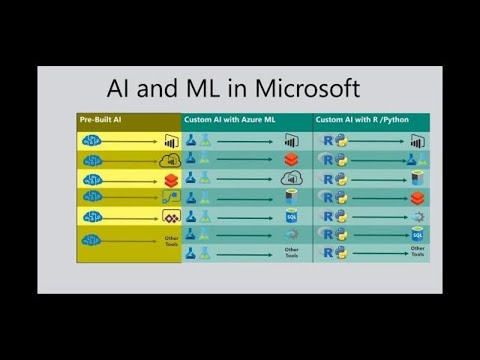
Let’s take a 50,000-foot view of the entire Power BI platform before diving into particular AI features. Melissa Coates, a Microsoft MVP and Addend analytics alumnus, has a beautiful diagram that shows all of the different components of the Power BI platform. The most important thing to remember is that Power BI is much more than a “visualisation tool.” Power BI is an enterprise BI platform that is mature and current. Melissa’s diagram is shown below, however I focused on certain sections of the platform where we’ll find unique AI features. We’ll go through each feature in further depth in the following sections.
2 – Take note of how AI is being incorporated into data visualisation, data preparation, and data modelling.
Components for Power BI
Small Light Bulb Icons We use graphics in Power BI to effortlessly evaluate and analyse our data. The light bulb icon in Power BI now indicates that there are three explicit AI visuals. Various AI elements embedded within traditional visualisations, such as bar and column charts, can also be used.
Decomposition Tree
The Decomposition Tree is the Power BI team’s most recent AI visualisation. This is a very dynamic visual that allows you to decompose (split down) a measure across AI Splits several dimensions by numerous attributes. This diagram can be used for exploratory analysis on the fly to better understand your data. It can also be used to undertake root-cause analysis, which is aided by the AI functionality embedded in. When drilling into the tree, for example, you can select “High value” or “Low value.” Selecting one of these causes the graphic to conduct an “AI split,” identifying the next field to drill into and displaying the highest or lowest value, as appropriate. Because the Decomposition Tree is now in public beta, we may expect a lot of improvements in the following months.
3 – Decomposition Tree is the most recent feature to Power BI’s AI visualisations. For a long time, it was one of the most sought features.
Key Influencer
A feature that we previously blogged about is the Key Influencers graphic. The first AI visualisation in Power BI is Key Influencers. Since it was first made available in public preview in February 2019, the look has received several improvements. When you want to eliminate the guesswork from studying the drivers behind a condition or measure, Key Influencers is a wonderful picture to employ. See how we enhanced our Employee Retention Showcase report to pinpoint the major factors that influence employee flight risk.
4 – Key Influencers works with continuous values as well! We’re looking at what factors drive home sale price rises in a certain county, as seen above.
Visual Q&A
The Q&A graphic debuted in October 2019 as part of a bigger makeover of the Q&A. Q&A feature was previously only available as a button in Power BI reports, but now we have a fully complete visual that behaves and acts like any other Power BI visual. This means that features like report themes and cross-filtering will be available in the new Q&A graphic as well! When using your report, you can leave the graphic in a “Q&A state” so that end users can continue to ask their own questions. If you like a particular visual made by asking questions, you may convert it to a regular visual by clicking the symbol in the top right-hand corner.
5 – Above is a side-by-side comparison of two Q&A visuals. Based on the natural language inquiry, one has developed a map graphic for us. The other has been left in its default state, with some possible suggestions to get you started with your investigation.
The Q&A Tooling interface was also published in October 2019. You can use the new interface to do things like:
- Examining the underlying dataset for queries that users have asked
- You can provide translations
- for both nouns and adjectives while teaching Q&A to help students grasp queries and terminology.
- Synonyms will be created behind the scenes by teaching Q&A phrases in the interface.
- Keeping track of the terminology and concepts you’ve taught in Q&A
6 – The new Q&A Tooling interface, which is still available for public testing.
AI and Microsoft Power BI: The realm of impossible – THR2038
Insights
The final data visualisation tool we’ll discuss is “Insights,” which permits AI-powered analysis within standard visuals that we’re all accustomed with.
Explanation of Increase and Decrease
This feature allows you to have Power BI identify and explain the difference between two data items. For instance, let’s say you notice a significant growth in sales over the course of two years. Instead of conducting a manual analysis to explain the increase in sales, Power BI can do it for you!
7 – Using Power BI to show how sales increased between two data points.
Look for areas where the distribution differs.
This function is especially handy if you want to quickly discover sub-populations in your dataset where the data distribution differs from your analysis. This tool eliminates a lot of the guesswork from your research.
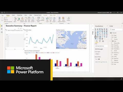
Getting Started with the Power BI Desktop
Preparation of Data
The ETL (extract-transform-load) operations that consolidate, convert, and enhance your dataset are referred to as data preparation. We’re talking about Power Query in Power BI Desktop and Power Query Online in Dataflows from a Power BI perspective.
Important: The features covered in the Data Preparation section all require Power BI Premium, as well as the AI workload being enabled within your premium capacity. This is due to the fact that Power BI makes use of Azure services such as Azure Machine Learning and Azure Cognitive Services. By purchasing Power BI Premium, you will indirectly pay for these capabilities. Consider them an added benefit of purchasing premium capacity.
AutoML (Automated Machine Learning) in Power BI
Users may construct, train, and invoke machine learning models using AutoML, a component of Power BI Dataflows. What’s the best part? This is completed entirely within Power BI! The business analyst was in mind when AutoML was created. AutoML is what I like to call “machine learning with training wheels.” Of course, I say this in the most adorable way possible. What I like about AutoML is that it allows business analysts and even traditional BI developers (like myself) to learn the fundamentals of machine learning while constructing a model that can make valuable predictions.
AutoML is now available to the entire public! Binary Prediction, General Classification, and Regression models are presently supported. Additional model types, such as Forecasting, are likely to emerge in the future. In the future, we can expect the ability to export ML models generated in Power BI to Jupiter Notebooks. This might be particularly beneficial for analysts or developers who wish to prototype functionality in Power BI before handing it off to a data scientist to fine-tune and standardise the model.
8 – You build machine learning models within a dataflow. Power BI was used to create the entire model.
Introducing Power BI Premium Gen 2
Services for the Mind
We may augment our dataset with prebuilt AI functions from Cognitive Services using Power Query.
9 – A look at Power BI Desktop’s new “AI Transforms” area on the Power Query ribbon. For this to operate, you’ll need to log in with an account that has access to a Power BI Premium licence.
Text analytics is a great application for these functions. Utilizing functions that allow sentiment score and key word extraction on text data, for example:
- User feedback
- Reactions on social media
- Each and every sentence from your favourite TV show
Modelling of Data
The process of developing in-memory, enterprise-grade, semantic models in Power BI is known as data modelling. In layman’s words, it lets you to create an environment in which analysts can create their own reports based on the model. Power BI can also quickly auto-generate insights for you using tools like Q&A and Quick Insights thanks to a well-defined data model.
Q & A
Users can ask natural language inquiries against their data model using Q&A. When compared to other vendor BI platforms, Q&A has long been a selling feature for the Power BI Service. Major enhancements to the Q&A capabilities were just released in the October 2019 Power BI release. The new Q&A graphic and Tooling Interface have already been mentioned.
Quick Insights
Quick Insights is probably the most straightforward AI function in Power BI. It’s as simple as selecting “Get quick insights” after clicking on your dataset. After that, Power BI will use a variety of algorithms to look for and detect trends in your data. This is where a well-designed data model will assist Quick Insights in producing more useful findings. After Quick Insights has completed its processes, click “View Insights” to see if any of the offered visualisations should be saved by pinning them to a dashboard.